Is your home giving off builder basic when you’re dreaming of architectural digest chic ? We get it and we’ve been there with hundreds of our clients across the Lower Mainland. At Roarty Painting, we believe your home should reflect your best self. And the fastest, most cost effective way to elevate your home’s look? Choosing the right paint colors. In this guide, we’re sharing the top paint colors to make your home look more expensive, drawing from our hands on experience in Vancouver neighborhoods, knowledge of color psychology, and stories straight from satisfied clients.
Paint isn’t just a finish. It’s a feeling, a first impression, and a value booster. Our goal? To help you pick the best paint colors that add curb appeal, class, and character.

Why Paint Color Matters More Than You Think
Paint is often underestimated. But ask any real estate agent, contractor, or design enthusiast color changes everything. Whether you’re aiming to sell or planning to stay put, the right hue can dramatically boost your home’s perceived value. From neutral bases to bold accents, paint colors speak volumes about your style and the care put into your home.
In the Lower Mainland, our climate presents unique challenges and opportunities. Bright colors can appear muted under cloudy skies, while moody tones can feel cozy and high value when done right. At Roarty Painting, we’ve learned how to work with Vancouver’s lighting and weather, not against them. By choosing the best paint colors tailored to your home’s environment, we help clients achieve a look that feels upscale, not upcharged.
We assess everything from your landscaping and trim to the architectural style of your home before recommending top paint colors that create harmony and luxury. This is more than just painting; it’s thoughtful home enhancement.
The Psychology Behind Expensive Looking Homes
Have you ever walked past a home and thought, “Wow, that place looks expensive”? Odds are, it wasn’t the furniture inside it was the paint colors on the outside doing the heavy lifting. Color psychology plays a major role in creating a sense of elegance and value.
Rich, dark hues like navy and charcoal convey strength and sophistication. Soft neutrals like greige and creamy off white exude warmth and timelessness. When clients want to make their homes stand out, we lean into tones that are proven to elevate aesthetic appeal.
We once painted a North Vancouver home in a deep navy with sharp white trim. The result? Neighbors asked if the owners had done a full renovation. That’s the power of picking the right home paint colors. It influences perception both yours and others’. And here’s the best part: you don’t need a massive budget to make a bold impact. With the top paint colors to make your home look more high value, luxury becomes accessible.
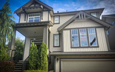
Top Paint Colors to Make Your Home Look More High Value
We’ve spent years painting homes throughout the Lower Mainland, from Burnaby to White Rock. Through that experience, we’ve seen which colors truly transform a property’s curb appeal. Below are the top paint colors we recommend to clients who want to make their home look more high end and polished.
Each of these shades has been field tested in real Vancouver weather, under real Vancouver skies. Whether you’re aiming for modern elegance, cozy sophistication, or classic charm, the following color options are proven winners.
Navy Blue
Navy blue is a bold, confident choice. It’s one of those home paint colors that gives a property instant gravitas. When we paint homes in navy, the results are striking especially when paired with crisp white trim or warm brass fixtures.
In neighborhoods like Kitsilano and Mount Pleasant, navy blue fits beautifully with older heritage homes. It respects their character while giving them a luxe refresh. Navy doesn’t just look good it lasts. It hides dust and dirt, ages well, and adapts to different lighting, which is crucial in cloudy Vancouver settings.
We recommend navy to homeowners looking for something different, but not trendy. It’s elegant, dependable, and undeniably upscale. Trust us the compliments from your neighbors will start before the second coat dries.
Charcoal Gray
Charcoal gray is one of the best paint colors for modern homes that want to look polished but not pretentious. It’s sleek, balanced, and visually grounding. When we paint a home charcoal gray, it instantly looks more architecturally refined.
Popular in Yaletown and Commercial Drive, charcoal gray enhances clean lines and bold angles. It pairs well with natural materials like wood, stone, and greenery. For trim, we often suggest pairing it with soft whites or even bold contrasting tones, depending on the style.
This color works especially well in matte finishes, where it absorbs light rather than reflecting it, creating a sophisticated look all day long. It’s a favorite among homeowners who want top paint colors that impress without shouting.

Olive Green
Looking to blend your home with the natural beauty of the Lower Mainland? Olive green offers an earthy, elevated tone that feels at once fresh and timeless. It’s perfect for homeowners who want their property to stand out quietly.
We recently completed a project in Burnaby Heights with olive green siding and off white trim. The result was warm, inviting, and distinctively elegant. This color is especially flattering on homes with lots of surrounding greenery or natural wood elements.
Olive green is one of those top paint colors to make your home look more expensive because it shows restraint. It says, “We thought about this,” without needing to say a word. And when it comes to exterior style, that quiet confidence goes a long way.
Creamy Off White
Classic, bright white can sometimes be too stark especially in our overcast climate. That’s why creamy off white is one of the best paint colors we recommend for homes that want to stay light and elegant without looking sterile.
In West Vancouver and the North Shore, this shade is often used on homes with colonial or craftsman features. It works beautifully with dark shutters, slate roofs, and natural stone walkways. The warmth of creamy white softens the edges of any property, making it feel more inviting and timeless.
It’s also a great backdrop for accent details colorful front doors, lush greenery, or patterned tiles. If you’re looking for a clean, high end look that won’t age out in five years, creamy off white is a smart, stylish pick.
Greige
Greige the hybrid of gray and beige is the neutral hero you didn’t know you needed. It’s modern, warm, and works with practically every architectural style. If you want a home paint color that stands the test of time, greige is your answer.
In Langley and Port Coquitlam, we’ve used greige on everything from ranchers to modern townhomes. It complements a wide range of materials and trim styles, from white to black to wood tones. Greige feels organic, grounded, and sophisticated all qualities that make a home look more expensive.
It also adapts beautifully to different weather conditions. Under Vancouver’s cloudy skies, it doesn’t feel gloomy it feels cozy and refined. It’s a reliable choice for homeowners who want the best paint colors that offer longevity and versatility.
Black with White Trim
A black exterior makes a bold statement but when done right, it looks modern, high end, and editorial. We often pair black siding with white trim and metallic fixtures to create sharp contrast and visual drama.
In neighborhoods like Deep Cove or Main Street, where architecture leans contemporary, this color combination stands out in the best way. It works particularly well with minimalist landscaping and clean structural lines.
For clients interested in taking a risk that pays off, black with white trim remains one of the top paint colors to make your home look more expensive. It’s daring, but undeniably upscale when balanced correctly.

How Lighting and Rain Affect Paint Colors
Choosing the right paint color in the Lower Mainland isn’t just about swatches it’s about understanding light and weather. Cloudy days and frequent rain can drastically alter how colors appear.
At Roarty Painting, we always test samples in natural light before committing to a full application. We’ve learned the hard way that a taupe might look tan in store but turn greenish gray on a rainy day. That’s why local expertise matters.
Our team understands how Vancouver’s weather plays with pigments. We adjust recommendations based on sun exposure, foliage, and architectural nuances. That attention to detail ensures the final product looks just as luxurious outside your home as it does in your imagination.
Don’t Forget the Trim, Doors, and Accents
Want to elevate your home without repainting the whole thing? Start with the details. High gloss black doors, brass hardware, and natural wood trim can transform an ordinary exterior into a showstopper.
These elements are often the finishing touches that complete a luxury look. We encourage clients to think about their home like a well styled outfit sometimes it’s the accessories that make the biggest impact.
At Roarty Painting, we regularly help clients fine tune their accent colors, hardware, and materials to match their chosen palette. These small changes can have a massive effect on your home’s overall feel, especially when paired with one of the top paint colors to make your home look more expensive.
Frequently Asked Questions (FAQs)
Q: What are the best paint colors to make a home look more high value
A: Top choices include navy blue, charcoal gray, olive green, creamy off white, greige, and black with white trim. These colors create a sophisticated, high-end aesthetic and work well in various lighting conditions.
Q: Do dark paint colors really make a house look more luxurious?
A: Yes, dark paint colors like navy and charcoal gray convey elegance, depth, and timelessness. When paired with sharp trim or metallic accents, they instantly elevate a home’s curb appeal.
Q: What paint color works best in Vancouver’s cloudy weather?
A: Colors like greige, olive green, and creamy off white adapt well to overcast lighting. They maintain warmth and sophistication without looking dull or washed out.
Q: Can paint really increase a home’s value?
A: Absolutely. A strategic color palette can significantly boost perceived value and help sell your home faster. Color psychology and curb appeal play a huge role in buyer perception.
Q: Is it better to paint the whole house or just focus on accents?
A: Focusing on trim, doors, and accent features like hardware or shutters can provide a luxury feel without a full repaint. It’s a smart and budget-friendly approach.
Bringing It All Together
Your home’s exterior is its handshake to the world. It sets the tone for your entire property and reflects your personal style. At Roarty Painting, we know that the right color palette can do more than make your home look beautiful. It can increase its value, enhance your lifestyle, and even boost your confidence in how your space is perceived.
Choosing from the top paint colors to make your home look more high value isn’t just a design decision. It’s an investment in your home’s future and your daily satisfaction. Whether you opt for navy’s timeless charm, greige’s versatile calm, or the bold contrast of black and white, each hue brings your property one step closer to its full potential.
Ready for a Home That Looks Like a Million Bucks?
At Roarty Painting, we specialize in helping homes across the Lower Mainland look polished, premium, and perfectly suited to their surroundings. From color consultation to prep and cleanup, we take pride in every brushstroke.
If you’re ready to explore the top paint colors to make your home look more luxurious, give us a call. We’ll guide you through the process, make expert recommendations, and ensure the results speak for themselves.
Roarty Painting
Proudly serving Vancouver, Burnaby, Coquitlam, Maple Ridge, Port Coquitlam, and beyond.
- Phone: 604-477-9184
- Email: roartypainting@gmail.com
Let us help you bring that vision to life, one brushstroke at a time. Because at the end of the day, when your home looks expensive, it feels even better to come home to it.